In order to be effective in Data Visualization you must be familiar with common visualization forms and their appropriate use cases.
Process Behavior Chart
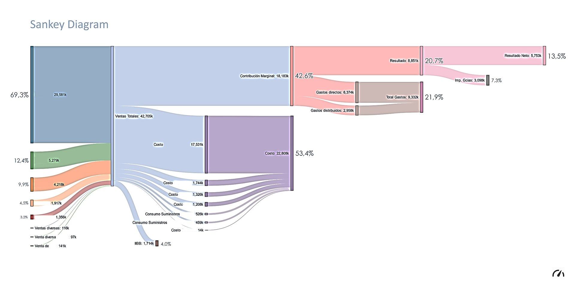
Sankey Diagram
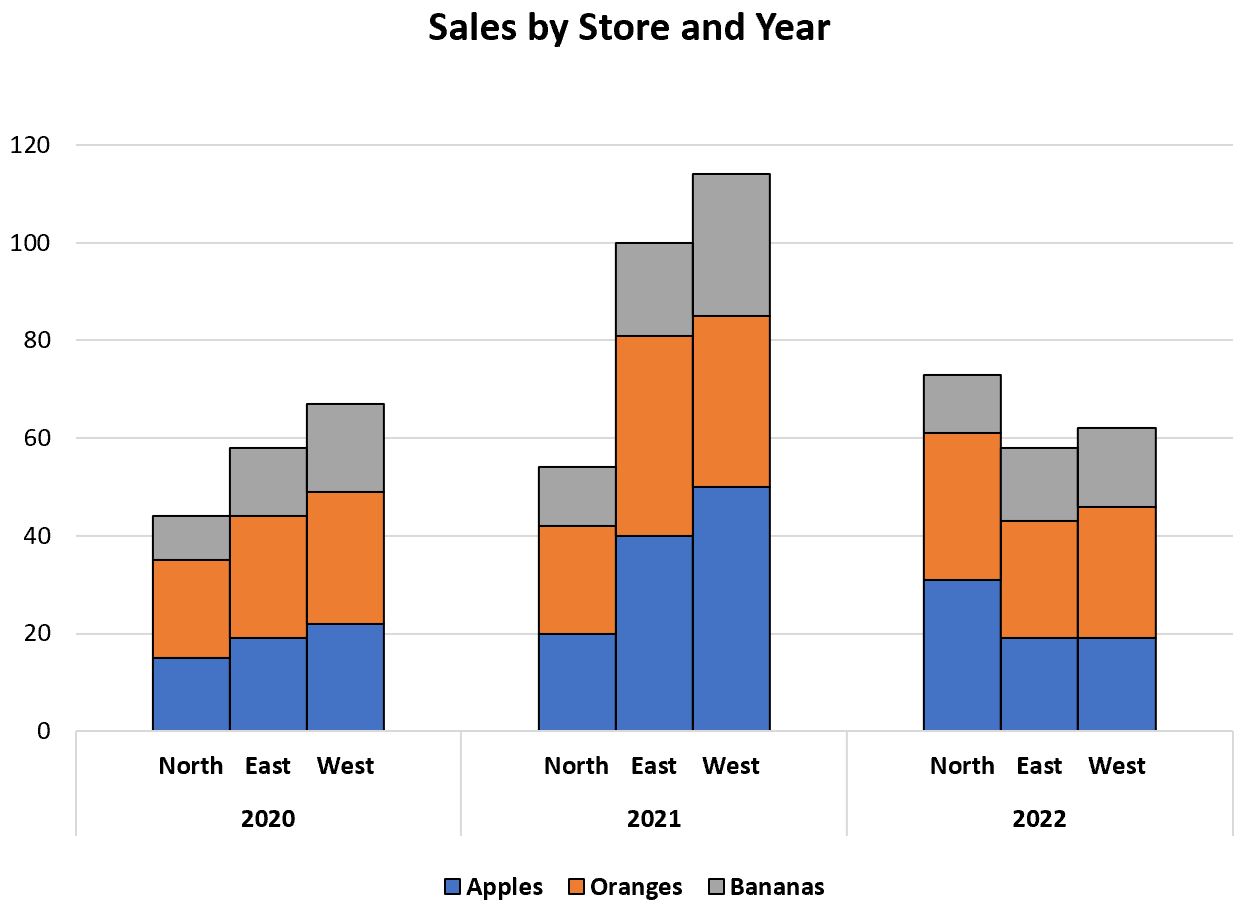
Clustered Stacked Column Charts
In Excel
To create a clustered stacked bar chart in excel you need to “hack” around Excel’s native column chart type to achieve a clustered stack. You do this by creating blank columns in your table to separate the cluster and then collapsing the spacing between columns. Adding blank rows allows you stack values on top of each other. See this site for an example.
Avoid
Pie Charts
Pie charts are common and poor stand in for a simple table. They are a snap shot in time, and therefore do not convey much information aside from proportionality. A reasonable use case might be a budget where you want to frame things in dollars (rather than percents), but still understand proportionality. However, you often want a time/trend perspective, so look for other tools.